
Data can be manipulated and presented to support a specific narrative or a particular conclusion. Because of this, you’d be well advised to seek out and analyze data for yourself, as opposed to allowing others to summarize and present that data for you.
A number of data sources are particularly helpful regarding the COVID pandemic. Instead of relying on others to draw conclusions from raw data, you’re better off analyzing for yourself.
Three things really matter in the discussion of COVID-19:
The Infection Rate
The infection rate not only tells us about the spread of the virus; ultimately it informs about the lethality of the coronavirus. Of course, lethality is difficult to measure during an outbreak, especially when so many infections are asymptomatic.
Indeed, a Penn State University study estimates that the number of people infected in March 2020 was 80 times the officially reported number (in other words, there were 8.7 million more infected people in March than reported).
Estimates of lethality vary, but the early projection of 3.4% from the WHO appears to be wildly overstated. Dr. John Ioannidis of Stanford makes the case for a lethality of 0.25%. You can monitor the confirmed infection rate for yourself on a daily basis, including by state, at a helpful site from USA Today that posts data from Johns Hopkins University.
By watching this number – a minimum (as stated by USA Today), due to the great number of asymptomatic and unreported cases – you can correlate the rate of infection with other key metrics.
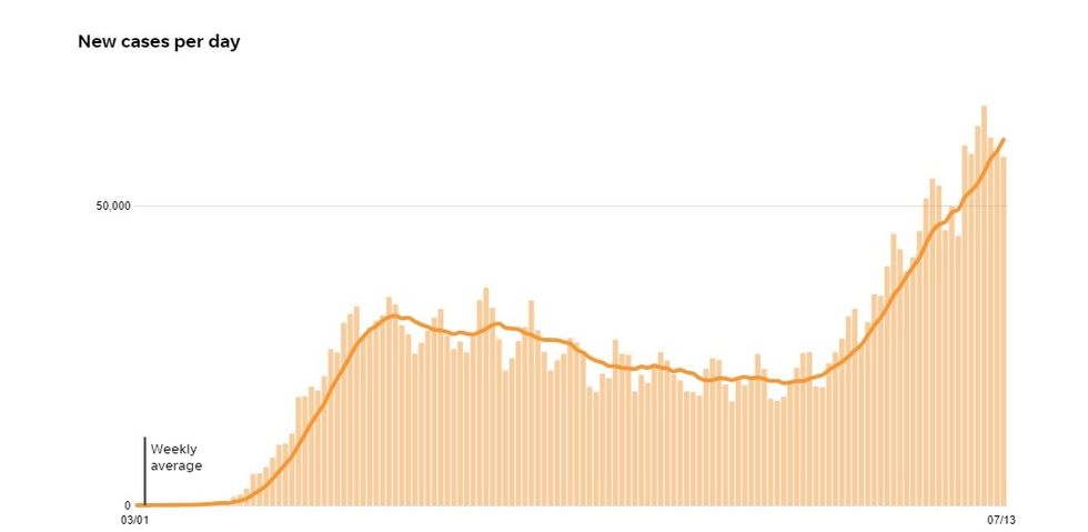
As of today, the new cases curve looks like this:
The Death Rate
Bearing in mind that any death in which the deceased has tested positive for Covid has been classified as a “Covid death” regardless of other contributing factors, you can monitor daily deaths at the same USA Today site.
Safeguarding human life should be our main concern, so please look at the data critically. On June 25th, for example, a spike appears in the data which, after digging through data state-by-state, incorporates results from a retroactive reclassification of ~1,800 deaths in New Jersey as COVID-related.
It’s helpful to cross reference with the Worldometer site to identify any large daily discrepancies that could result from retroactive changes. By watching this number, including data concerning state levels, you can begin to correlate the tragic human toll of this disease with infection rate and public policy.
You can also start to draw conclusions as to both lethality and improvements in treatment over time. As of today, the death rate curve looks like this:
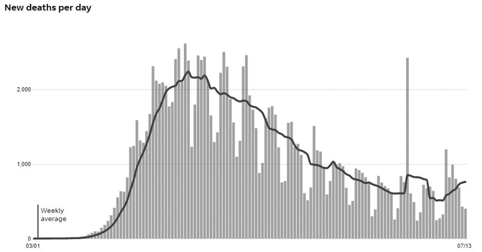 June 25th reclassification of ~1800 deaths by NJ.
The Hospitalization Rate
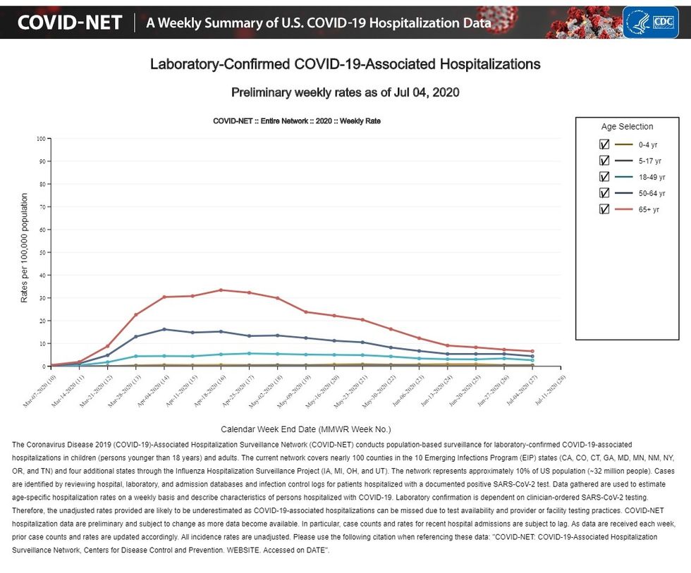
The need to “bend the curve” and avoid overwhelming our hospitals initially drove the lockdown strategy. So, understanding the actual rate of hospitalization nationally remains very important. The CDC publishes that rate on a weekly basis, helpfully sorted by age group.
As of July 4th the hospitalization curve looks like this:
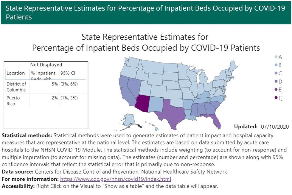
In addition, the CDC publishes state by state data with regard to hospitalizations so you can see the situation on the ground. As of July 10th, Arizona has an in-patient COVID occupancy of 28.4%, followed by Texas and Florida at 16% each.
The national picture looks like this:
Realize that these important metrics only take into account the COVID variable itself; they don’t deal with the economic and collateral public health consequences of public policy. As public health officials – such as Dr. Fauci – clearly state, they don’t advise on economics or on the broader impact of health policy recommendations.
I suspect that most people are quite able to judge the impact of policy on themselves, their families, and their communities.
The point of this article is to encourage everyone to take advantage of the information that is readily available – and the above is only a start. You should think critically and form your own opinions.
Obviously, any data set will be a snapshot of a given moment, but it allows you to access that data and monitor it over time.
Margaret Caliente is a professional athlete turned internet entrepreneur and Manhattan-based journalist.