

Regarding numbers of daily new cases and daily deaths, countries have been adding discovered deaths from homes, nursing homes, and other care facilities at various points in time. These countries include Belgium, the UK, Ireland, and the US. On various web sources the data has all been adjusted. Cases that remain “probable” are excluded here as they are not confirmed to be COVID related.
As explained in Part 4, it is the case density (cases per 100,000 people) that matters and not the total number of cases. The higher the number of cases per 100,000 people, the more dangerous the location. An example would be riding in a subway car. If a location in question has a high case density, it is more likely that riding on a subway car in that location will have more passengers on it who are infected compared to riding in a subway car in a less densely infected location.
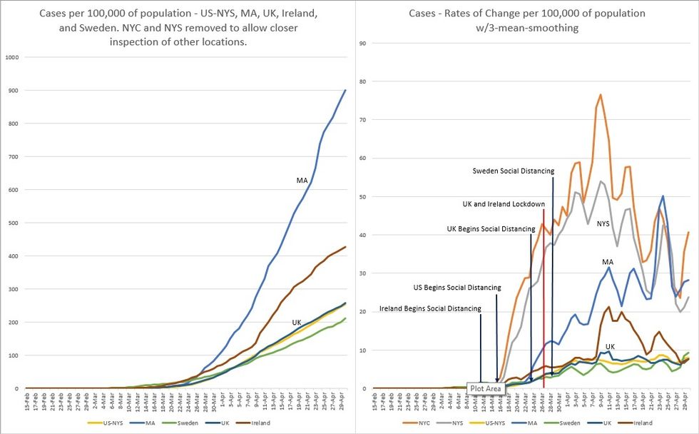
In Figure 1, we know that for cases per 100,000 population basis, the NYC and NYS curves are very steep. When plotted with other locations, the plots of the other locations are squashed significantly to obscure meaningful information. Therefore, the plots of NYC and NYS have been removed to better understand what’s going on elsewhere.
However, for the rates of change chart, NYC and NYS plots were left in, as they didn’t substantially squash the other plots. Also, note that within the last week, US and NY data (cases and deaths) were updated (values increased). This reflects all dates from early March, shifting their curves a bit leftward.
On the left of Figure 1, one can see that Massachusetts is experiencing the largest surge in cases experienced so far, and Massachusetts is now the epicenter of case growth. But to maintain a perspective, New York State still carries 29% of all cases in the US and 9.5% of all cases in the world, but this is slowly decreasing. By contrast, Massachusetts carries 5.6% of all cases in the US and 1.8% of all cases in the world, and this is slowly increasing.
On the right of Figure 1, Massachusetts has surpassed NYC and NYS in the number of daily new cases per 100,000 population. Comparing the shapes of the plots between NYS and Massachusetts, they seem to be similar. This may indicate that Massachusetts may have also experienced its peak number of new cases, although it’s too early to tell.
Sweden is on a surge that seems to be higher than the previous one. The UK and Ireland seem to have a decreasing number of daily cases. But the UK may be under-testing as their deaths per 100,000 population are higher than that of Ireland (see Figure 2).
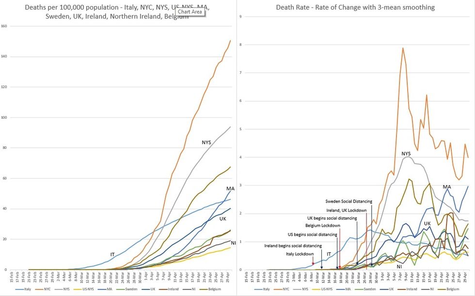
Figure 2 shows that Italy’s maximum daily deaths occurred on 3/28, 19 days after lockdown and this continues to trend downward. In Ireland, the maximum daily deaths occurred on 4/25, 29 days after lockdown and 14 days after their peak number of daily cases. In Northern Ireland, the maximum daily deaths occurred on 4/23, 27 days after lockdown and 5 days after their peak number of daily cases (not shown in the charts). Sweden is on its 5th surge, possibly the largest so far.
As the majority of cases and deaths in NYS occurred in NYC, it would be expected that the peak numbers of daily new cases and daily deaths would occur at about the same time. This happened on 4/9-10, 23-24 days after social distancing began.
For “The Rest of the United States” (US minus NYS or US-NYS), the maximum number of deaths is unclear as the curve has been relatively flat with a few very small peaks that may be statistically insignificant. We do know that the maximum daily new cases occurred on 4/24, 38 days after the start of social distancing.
Massachusetts is on its 6th surge, which may be the largest so far in terms of daily deaths. Referring back to its plot in Figure 1, the peak number of daily new cases occurred a week ago. And we know that deaths follow cases. We are hopeful that this surge will mark a subsequent decline in the number of daily deaths.
After 44 days of social distancing, the question must be asked: Why are we still surging in daily deaths? Also, from Parts 1 and 2 of this series, Massachusetts began social distancing at the same time as New York. However, we had a much less number of cases at that time, giving us a 2-week head start advantage over New York. Yet we are experiencing a pattern similar to New York, but delayed by 15 days.
Perhaps our close proximity to New York may explain this in part. It could also be explained by a possible longer latency time between being infected and expressing symptoms. Our policy is to test only those with symptoms, so this may make sense.
Sources of data: Worldometer.com, Spectrum News NY1, New York State Department of Health, Massachusetts Department of Public Health, HSC Public Health Agency
- COVID-19 Update: Mass. Tops New York in Daily Casualties – Liberty Project ›
- COVID-19 Update: New York and Mass. Continue to Improve – Liberty Project ›
- COVID-19 Part 8: Georgia Sees Increase in Cases and Deaths 3 Weeks After Lifting Lockdown – Sweden Continues Without Clear Downward Trends – Liberty Project ›