

To recap: we have been following the pandemic in Italy, New York State, New York City, Massachusetts, Sweden, the United Kingdom, Ireland, Northern Ireland, and Belgium in terms of cases per 100,000 population and deaths per 100,000 population, as well as the rates of change of these numbers.
Last week we looked at the number of daily new cases and the number of daily deaths to see if they were increasing or decreasing. We looked at the numbers for hard, non-ideological proof.
Read Part 1 of Anthony Lee, MD’s research, tracking changes in the spread of COVID-19
Superimposed on the charts were markers indicating when designated locations enacted social distancing or lockdowns and showed the effects of these measures on the number of new daily cases and daily deaths.
Although the popular media tends to treat the United States as a single location, if we separate New York State from the rest of the United States, two different stories emerge.
This article will view the number of cases and deaths on a per 100,000 population basis to describe the density of cases and reveal the true severity of the pandemic in a specific location.
As of this writing, NYS contains approximately 33% of all US cases and 10% of all cases in the world. The US has roughly 583,500 cases with a population of 331 million people, or 176.2 cases per 100,000 people. In contrast, NYS has roughly 195,000 cases with a population of 19,540,000. This represents a very disturbing 998 cases per 100,000 people, which is significantly worse than the US combined.
If we isolate NYS from the rest of the US, the number stands at 124.7 cases per 100,000 people. In contrast, Italy has 159,516 cases and a population of 60,480,000, or 263.8 cases per 100,000 people. In other words, from the perspective within a particular location, NYS is nearly 4 times as severe as Italy, and Italy is roughly twice as severe as “the rest of the United States”.
Separating NYS from the rest of the nation achieves two things. First, it provides a more accurate picture of what is happening in most of the US and shows that the overall situation is not apocalyptic. Second, and more importantly, it allows us to focus on the true severity of what is happening in NYS. This will help us make decisions about how to deal with the pandemic’s true epicenter.
Below are the updated charts. “The rest of the United States” is represented by the label “US-NYS (US minus NYS)”. Because of time differences, US data lags behind that of Europe and the UK. Therefore, plots are likely to be limited to the day before a report is published. In some cases, late reporting from European countries and the UK may also limit plots to the day before.
Cases
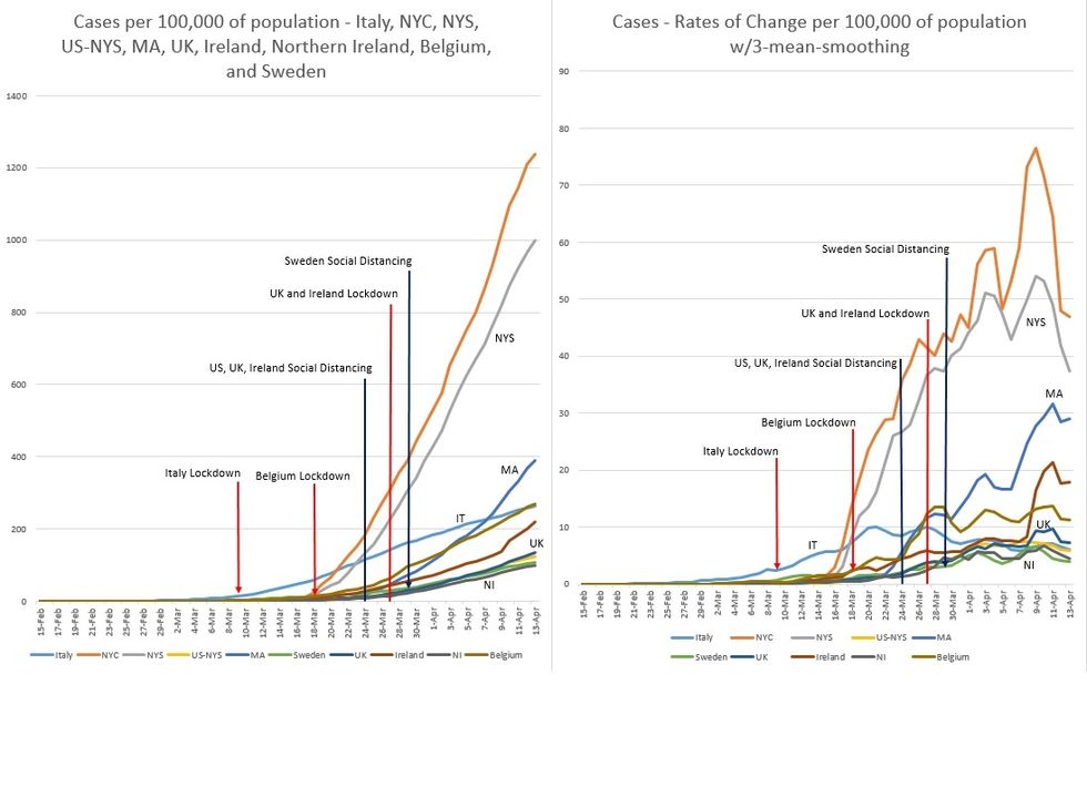
Figure 1. Cases per 100,000 population by location and correlated rate of change.
Figure 1 shows the effects of lockdowns and social distancing. It took Italy 12 days to finally flatten the curve of daily new cases. This trend has been continuing for the last 23 days, producing the trailing edge of the pandemic in Italy.
It took Belgium 11 days to reduce the number of daily new cases, and they have also continued on a downward trend for the last 15 days.
Ireland required 7 days of lockdown to reduce their daily new cases. This trend continued over the next 4 days, but then a new surge of cases occurred. The same holds true for Northern Ireland, where 6 days of lockdown reduced the number daily new cases. This trend continued over the next 5 days, but then a small surge of cases emerged.
Sweden maintains a low and flat trajectory despite loose social distancing. This might be accounted for by lack of testing.
The UK and “the rest of the US” (as defined above) remain on low and flat trajectories due to their respective social distancing policies.
NYS and NYC cases are rising dramatically, even in the face of a shortage of testing. Testing has increased in Massachusetts over the last 3 weeks and is reflected in the figure. In the weeks leading up to lockdown protocols NY has been about 5-8 days behind Italy, while Massachusetts has been around 21-23 days behind.
Although NY and Massachusetts started social distancing at the same time, Massachusetts had a roughly 2-week head start ahead of NY. However, this margin has narrowed to about 6 days. Interestingly, the curve of Massachusetts now seems to shadow that of NYC with similar slopes and slope changes.
Deaths
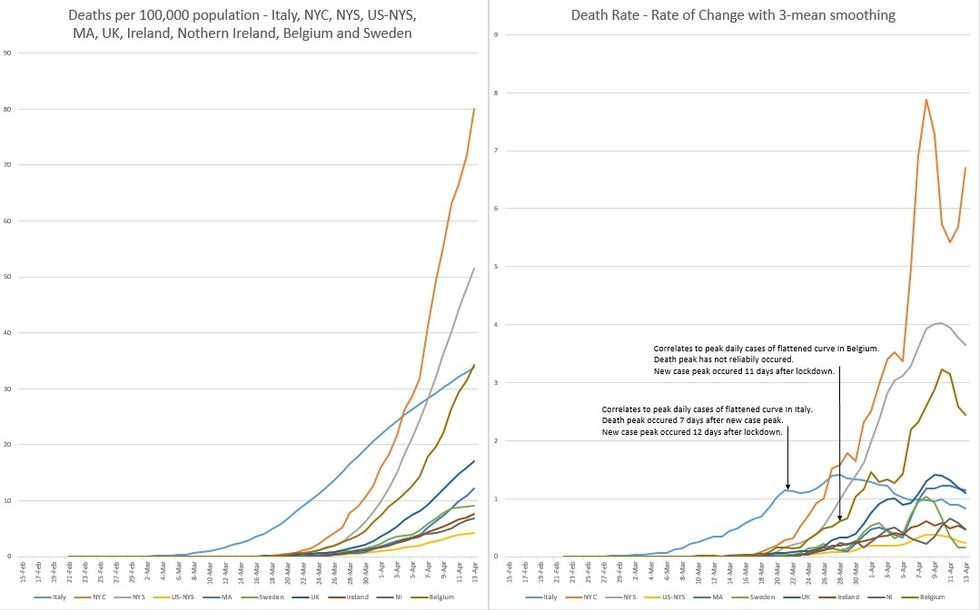
Figure 2. Deaths per 100,000 population by location and correlating rate of change.
Figure 2. shows rising deaths by location.
In the rates-of-change chart, the number of daily new cases flattened are delineated by date.
From the point of delineation rightward, we see when daily deaths begin to decrease. This lag time varies with locations. Italy’s lag time was 7 days. This hasn’t reliably occurred yet in Belgium. Although we see a decrease in deaths in Ireland, this is most likely temporary, as the country has seen a surge of new cases; and death plateaus follow new case plateaus. The same is true for Northern Ireland.
I will update numbers and discuss their implications in future installments.
Sources of data: Worldometer.com, Spectrum News NY1, Massachusetts Department of Public Health, HSC Public Health Agency