
COVID-19 Part 7: New York and Massachusetts Continue to Improve - Sweden Is Less Clear - Monitoring Georgia 17 Days After Lifting Restrictions
By Anthony Lee, MD
Faculty, Harvard Medical School
As we make our way through this pandemic, the large number of cases in the United States has caught our attention and prompted much discussion. In Part 7 of this series, we continue to see New York and Massachusetts reliably decline in the number of daily deaths. As we assume that the pandemic in these states is on the mend, we will no longer track the number of daily new cases.
Likewise, Ireland and the UK have not seen increases in daily new cases or deaths over the last 3-5 weeks, so we will no longer follow them. However, as these countries begin easing lockdown measures, this may change.
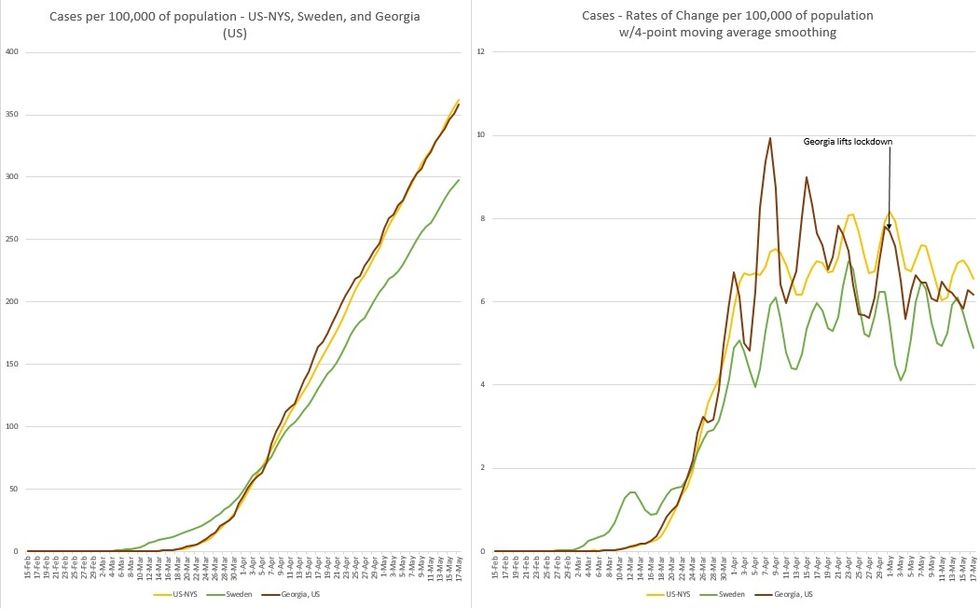
In Figure 1, the plot for "The Rest of the United States" (US minus NYS or US-NYS) is compared to those of Sweden and Georgia.
On the left of Figure 1, the cumulative number of cases increased at different rates by location. On the right of Figure 1, the number of daily new cases are declining in Georgia and the Rest of the US, while it plateaus in Sweden.
COVID-19 Part 6: Massachusetts Tops New York in Daily Casualties While Sweden Seems to Magically Improve
By Anthony Lee, MD
Faculty, Harvard Medical School
As we make our way through this pandemic, the large number of cases in the United States has caught our attention and prompted much discussion. In Part 6 of this series, we continue to see Ireland and the UK consistently decline in number of daily deaths. If we assume that the pandemic in these countries is on the mend, tracking the number of cases is no longer fruitful.
Likewise, Italy, Belgium, and Northern Ireland have not seen increases in daily new cases, or deaths, over the last 3-6 weeks so we will no longer follow them. However, as these countries begin easing lockdown measures, this may change.
Please note that this report will only consider confirmed COVID deaths.
As explained in Part 4 and Part 5, it's the case density (cases per 100,000 people) that matters and not the total number of cases. The higher the number of cases per 100,000 people, the more dangerous that location is. For example: riding in a subway car. If a specific location has a high case density, it's more likely that riding on a subway car in that location will have more infected passengers compared to a subway car in a different location.

In Figure 1, Plots of New York City and New York State are compared to Massachusetts, "The Rest of the United States" (US minus NYS or US-NYS), and Sweden.
On the left of Figure 1, Massachusetts' cumulative number of cases continues to rise. On the right of Figure 1, the number of daily new cases in Massachusetts is declining. However, its daily new cases now exceed that of NYS, which started to decline 15 days prior.
Want to READ MORE?
COVID-19 Part 5: Massachusetts Tops New York in Number of Daily New Cases Per Capita
COVID-19 - Part 3: The Inflection Point
This pattern is very similar to that of NYC, with a shift to the right of 15 days. Although NYS started social distancing measures concurrent with Massachusetts - which had far fewer cases per capita - Massachusetts continued to rise, peaking 15 days after NYS peaked.
But to maintain perspective, NYS still carries 25.4% of all cases in the US and 8% of all cases in the world, but this is decreasing. In contrast, Massachusetts carries 5.9% of all cases in the US and 1.9% of all cases in the world, but this is gradually increasing.
25 days after starting light social distancing measures and an increase in testing, Sweden's number of daily new cases peaked on April 23. More significantly, Figure 2 (below) shows that Sweden's peak in daily deaths occurred at about the same time and has been improving over the last 18 days. This is amazing considering that their mitigation efforts were very mild compared to those in the rest of Europe.

Figure 2 shows that in Ireland, the maximum daily deaths occurred on 4/25 - 29 days after lockdown and 14 days after their peak number of daily cases. In the UK, the maximum daily deaths occurred on 4/11 - 15 days after lockdown.
As the majority of cases and deaths in NYS occurred in NYC, it would be expected that peak numbers of daily new cases and daily deaths would occur around the same time. This happened on 4/9-10 - 22-23 days after social distancing began.
For "The Rest of the United States" (US minus NYS or US-NYS), the data (Total US) was updated last week. With that, the maximum number of daily new cases and deaths occurred on 4/29 - 42 days after the start of social distancing.
For Massachusetts, the peak number of daily new cases and daily deaths peaked on 4/24 - 37 days after social distancing, or 14-15 days after NYS.
Questions that come to mind are:
1. Why did it take Massachusetts 37 days to improve after the start of social distancing, despite beginning with only 218 cases and no deaths, while NYC took only 22 days to improve, beginning with 923 cases (4x Massachusetts) and 7 deaths?
2. How did Sweden improve its numbers in 25 days - with very late and quite mild social distancing - despite beginning with 3,700 cases and 110 deaths?
Sources of data: Worldometer.com, Spectrum News NY1, New York State Department of Health, Massachusetts Department of Public Health, HSC Public Health Agency
COVID-19 Part 5: Massachusetts Tops New York in Number of Daily New Cases Per Capita
Regarding numbers of daily new cases and daily deaths, countries have been adding discovered deaths from homes, nursing homes, and other care facilities at various points in time. These countries include Belgium, the UK, Ireland, and the US. On various web sources the data has all been adjusted. Cases that remain "probable" are excluded here as they are not confirmed to be COVID related.
As explained in Part 4, it is the case density (cases per 100,000 people) that matters and not the total number of cases. The higher the number of cases per 100,000 people, the more dangerous the location. An example would be riding in a subway car. If a location in question has a high case density, it is more likely that riding on a subway car in that location will have more passengers on it who are infected compared to riding in a subway car in a less densely infected location.
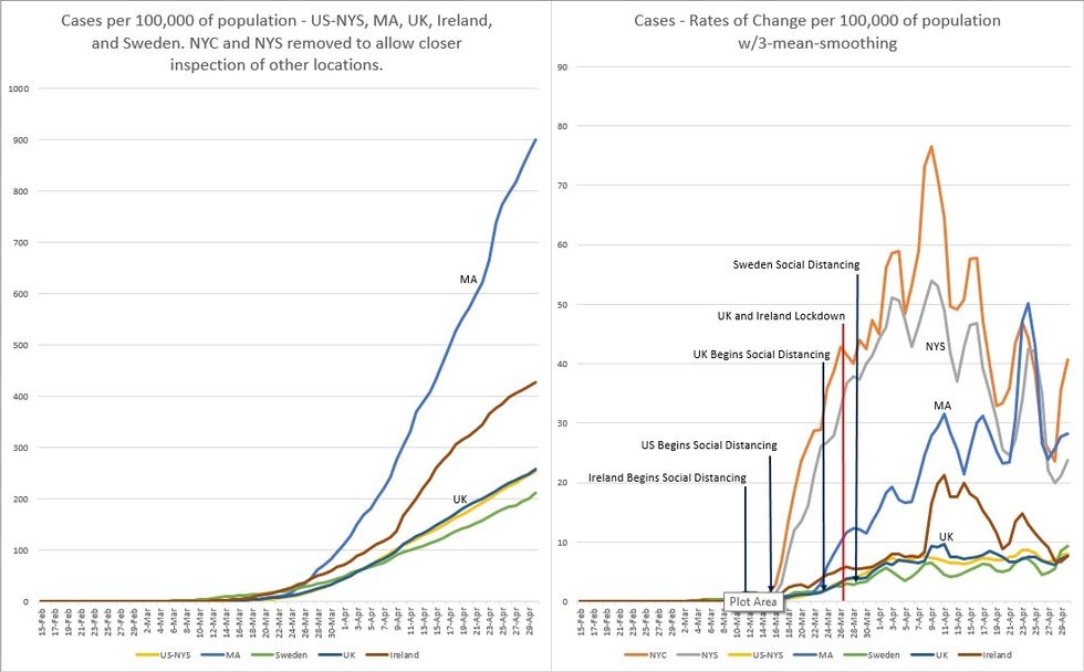
In Figure 1, we know that for cases per 100,000 population basis, the NYC and NYS curves are very steep. When plotted with other locations, the plots of the other locations are squashed significantly to obscure meaningful information. Therefore, the plots of NYC and NYS have been removed to better understand what's going on elsewhere.
However, for the rates of change chart, NYC and NYS plots were left in, as they didn't substantially squash the other plots. Also, note that within the last week, US and NY data (cases and deaths) were updated (values increased). This reflects all dates from early March, shifting their curves a bit leftward.
On the left of Figure 1, one can see that Massachusetts is experiencing the largest surge in cases experienced so far, and Massachusetts is now the epicenter of case growth. But to maintain a perspective, New York State still carries 29% of all cases in the US and 9.5% of all cases in the world, but this is slowly decreasing. By contrast, Massachusetts carries 5.6% of all cases in the US and 1.8% of all cases in the world, and this is slowly increasing.
On the right of Figure 1, Massachusetts has surpassed NYC and NYS in the number of daily new cases per 100,000 population. Comparing the shapes of the plots between NYS and Massachusetts, they seem to be similar. This may indicate that Massachusetts may have also experienced its peak number of new cases, although it's too early to tell.
Sweden is on a surge that seems to be higher than the previous one. The UK and Ireland seem to have a decreasing number of daily cases. But the UK may be under-testing as their deaths per 100,000 population are higher than that of Ireland (see Figure 2).
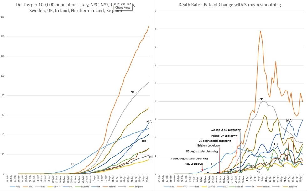
Figure 2 shows that Italy's maximum daily deaths occurred on 3/28, 19 days after lockdown and this continues to trend downward. In Ireland, the maximum daily deaths occurred on 4/25, 29 days after lockdown and 14 days after their peak number of daily cases. In Northern Ireland, the maximum daily deaths occurred on 4/23, 27 days after lockdown and 5 days after their peak number of daily cases (not shown in the charts). Sweden is on its 5th surge, possibly the largest so far.
As the majority of cases and deaths in NYS occurred in NYC, it would be expected that the peak numbers of daily new cases and daily deaths would occur at about the same time. This happened on 4/9-10, 23-24 days after social distancing began.
For "The Rest of the United States" (US minus NYS or US-NYS), the maximum number of deaths is unclear as the curve has been relatively flat with a few very small peaks that may be statistically insignificant. We do know that the maximum daily new cases occurred on 4/24, 38 days after the start of social distancing.
Massachusetts is on its 6th surge, which may be the largest so far in terms of daily deaths. Referring back to its plot in Figure 1, the peak number of daily new cases occurred a week ago. And we know that deaths follow cases. We are hopeful that this surge will mark a subsequent decline in the number of daily deaths.
After 44 days of social distancing, the question must be asked: Why are we still surging in daily deaths? Also, from Parts 1 and 2 of this series, Massachusetts began social distancing at the same time as New York. However, we had a much less number of cases at that time, giving us a 2-week head start advantage over New York. Yet we are experiencing a pattern similar to New York, but delayed by 15 days.
Perhaps our close proximity to New York may explain this in part. It could also be explained by a possible longer latency time between being infected and expressing symptoms. Our policy is to test only those with symptoms, so this may make sense.
Sources of data: Worldometer.com, Spectrum News NY1, New York State Department of Health, Massachusetts Department of Public Health, HSC Public Health Agency